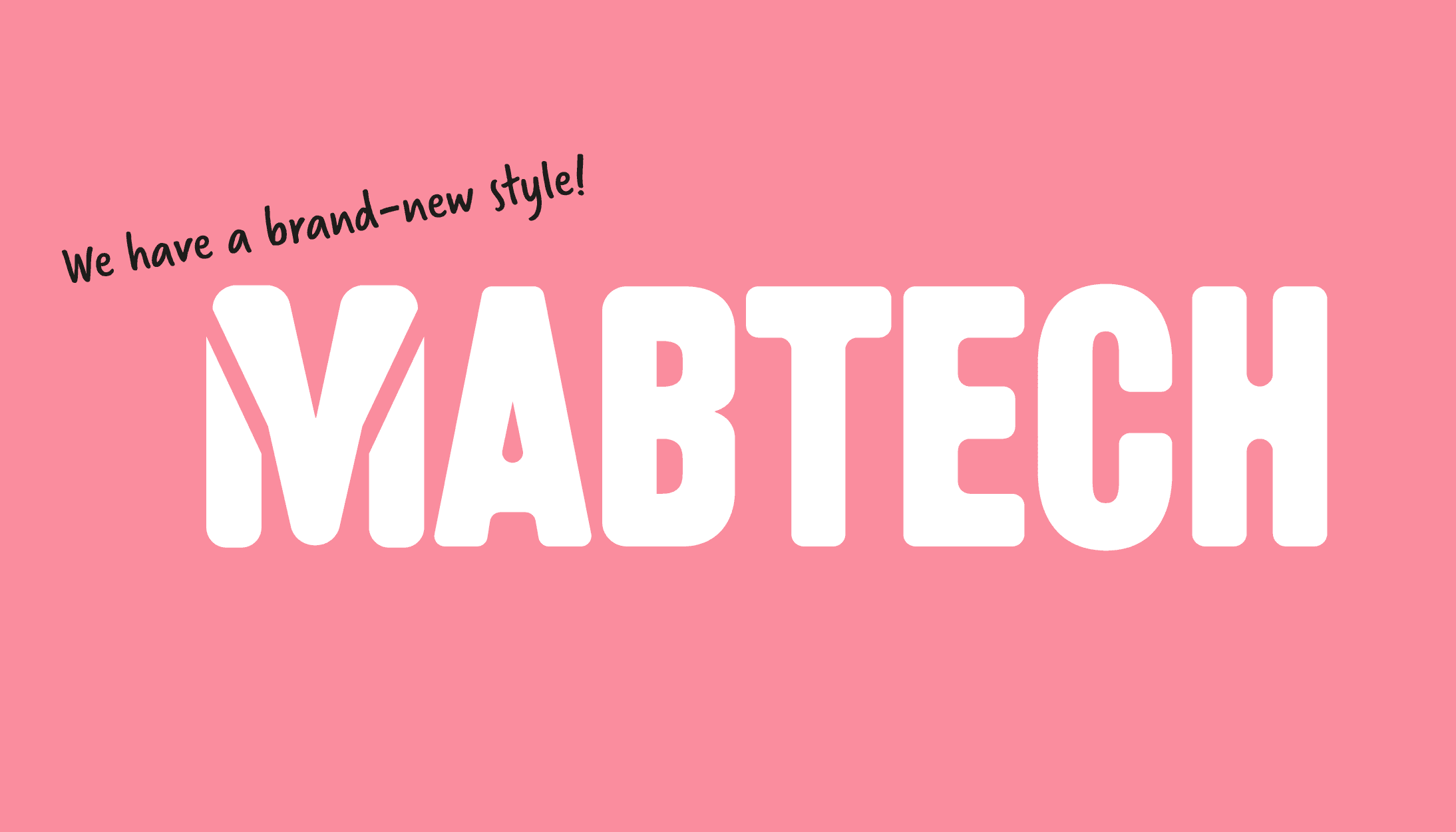
We have a brand-new style!
Published: November 30, 2022
Updated: January 13, 2023
4 minute read
Authored by: Jens Gertow
After 33 years producing, in our view, the world’s best antibody pairs, in 2018, Mabtech launched its first instrument: Mabtech IRIS. Since then, a second instrument, new kit formats, and custom services came along. Throughout this journey, our identity had stayed the same, but our mission had evolved, and we sought after a fresh way to communicate all of this – one grounded in science but dreamed up by creatives.
In 2021, the Marketing team backed by the whizzes working in R&D, Production, QC, and Sales started on the project. After questioning, exploring, and scrutinizing what makes us Mabtech in this era of trends and bots, today we deliver a new brand platform – a common identity. It also portrays our mission: to supply high-quality, dependable research tools and all imaginable support to the scientific community.
So, who are we now? Still the same ELISpot-loving Mabtech, but with a fresh look, which, we hope, better corresponds to this chapter in our history.
Jens Gertow is Chief Commercial Officer at Mabtech and the maestro orchestrating our branding journey. In this interview, we put the spotlight on him.
Hi Jens, let’s go spot on: why a new brand identity for Mabtech?
In my view, it’s not so much about creating a “new” brand identity, but to refine, emphasize and effectively communicate what has always been there, what we always have been about.
Mabtech was founded by friends working together at Stockholm university. Although we rarely see them in our lab nowadays, they have always been helpful to us employees as well to customers, taking the time to explain complex mechanisms in an effortless way. They are also meticulous researchers who’d never launch anything that hadn’t been well thought through and thus great. And, also perhaps a scientific trait, they are a bit quirky – science is fun, and a laugh is never far away.
Their personalities seeped through the walls and became the identity of Mabtech: helpful, meticulous, and a bit quirky. If you have interacted with us directly, you can probably recognize these traits. With the rebranding, we’d like every interaction – also the website, kit boxes, and protocols – to give you that same Mabtech feeling.
Tell us a bit about the new logo. How did it come about?
As the rebrand is about emphasizing what has always been there rather than a complete makeover, we needed a delicate redesign: The new logo resembles the old one, but the rounded edges and pink color better communicate our helpful and friendly nature. Practically, the antibody-“Y” is now better integrated and can also be used as a symbol.
What do the new colors make for?
The old colors red and grey did indeed stand for good stuff: grey being classic and intelligent, and red conveying a message of strength and energy. Good stuff, as said, but they weren’t completely “us”. Thus, we set out to find colors that better fit our identity, and landed on pink (friendly, innovative) and yellow (warmth, creativity). Together with our new unique font and joyful illustrations, we hope that these colors better communicate our personality.
What about the striking illustrations?
Our illustrations portray a dreamlike alternate universe where science meets fantasy. They’re a celebration of the beauty in biology, inspired by nature, where answers are hiding in secret places. We also wanted to get away from the steel colors that have become the trademark of “tech.” The eye-catching drawings and the new colors we talked about earlier are our way of cutting through the gray biotech clutter.
You even changed the names of some products as part of the project. Tell us why?
We have tried to be as transparent as possible with our product names; “what you get is in the name” so to say. But with an increasing number of products, we needed more obvious names that better communicate how they compare to other products in our portfolio. Thus, we updated most product names to be more pedagogical, more name-like, more readable – more Mabtech.
What comes next?
With the new website up and running, we gear up to create even more tips and tricks, guides, and video tutorials. We’d like you to see us as colleagues at a neighboring lab happy to help you untangle any scientific question you might be struggling with.


